

This project consists of a invitation poster, a double page spread magazine article, exhibition design and website design which are all focused on delivering commentary on the way that the media amplifies disability to ensure otherness for entertainment purposes. This is done with type as the main design element to meet the requirements of an ISTD project. This assignment demands the use of typographic skills to ensure optimal accuracy, legibility and readability. In depth engagement with the craft of typography and the understanding of the technical aspects of the execution is promoted with the requirement to produce a set of specifications for the assignment.
During the Victorian era, extreme contrast in representation and exaggeration of otherness was used to advertise people with deformities or oddities as mythical creatures from far away lands. For centuries these people have been used in the public eye for amusement and profit. The Victorian era saw a rise in so-called freak shows as people with deformities were exhibited for financial gain. Since then, the word freak has faded, but the show persists in modern mass media. This project aims to enlighten people of the objectification still taking place in mass media. This cruel social organization had a direct impact on the freak out-group to the point where they lost all connections with humanity, and were seen as objects and creatures used for entertainment purposes. The Oddity as commodity has since lost the connection to the word freak, but this extreme contrast in representation to ensure that deformity is seen as the out-group, prevails.
The plan was to elicit an emotional response from the public by comparing freak shows today vs freak shows from the past with an intent to show how cruelly they were objectified as the outgroup through the exaggerated representation of the media and to show that the objectification still continues. By doing this, commentary will be given on the public’s prevailing taste for deformity. The concept aims to bring the dark side of carnival freak shows to light. This dark side refers to the way in which people with deformities were objectified and dehumanized whilst being used by the in-group as means of entertainment. Today, Objectification might not be as cruel, but the oddity is still used for entertainment.
Publicity Poster
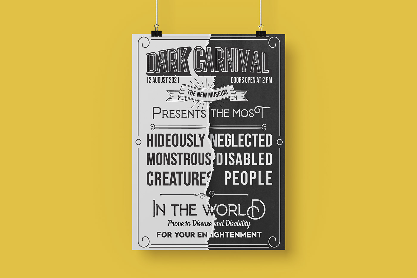

The poster acts as a catalyst to start the whole project. This poster is meant to create curiosity and intrigue the audience. Throughout the project, the type reflects the showman as is he were there advertising the event. The poster reflects both the dark and light sides of the carnival. These sides can be read separately or together. By using both sides, contrast is created to showcase the exaggerated representation of the oddity.
Exhibition
The white exhibition posters reflect the light hearted side of the freak show, or rather the exaggerated version that the showman presents. Upon arrival, the audience will see these hanging posters first. They are designed in a decorative Victorian print style combined with a modern day aesthetic. Yellow is incorporated to symbolize the golden representation of these freaks. The back of these posters reflect the reality of who these people actually were and the hardships that they had to endure. It also speaks about the general themes under discussion. At the bottom of these posters is a QR code which can be scanned to lead the audience to the website


Website
The website mostly discusses how the main five themes are still objectified in modern mass media society. Here, the actual sickness refers to society's prevailing taste for deformity and the audience- the actual freaks.


Editorial
The double spread article that features after the exhibit has run its course. This article seeks to reach the target audience which were not at the exhibition. It also has a barcode which can be scanned that leads directly to the website.


THANK YOU!


